Published: 3 min read
How we built this website
The tools, the decisions and the real numbers behind prowebio.com, plus what we'd suggest copying for your own site and what to skip.
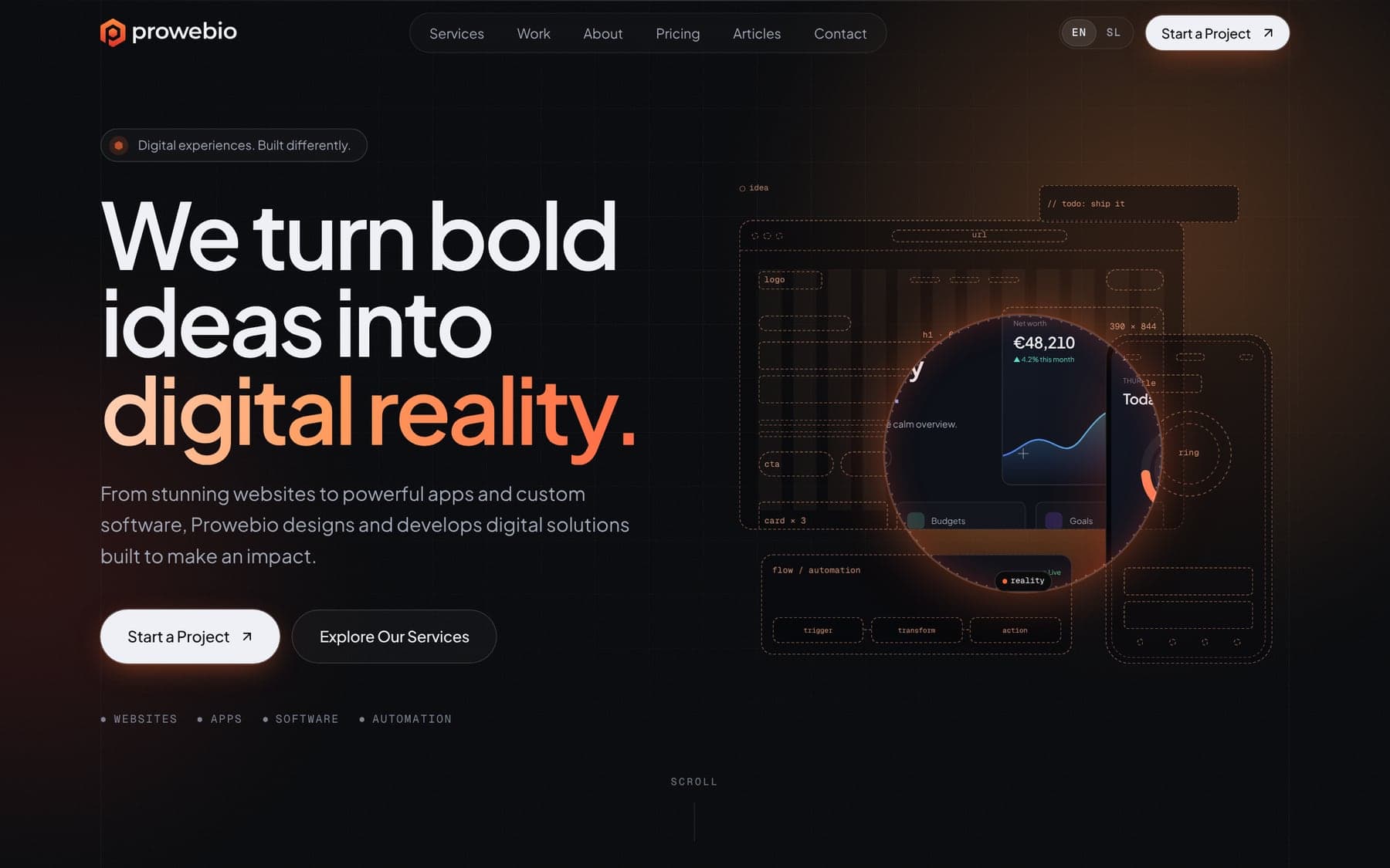
A studio's own website is the one project with no client to blame. Here's how we built ours, what it runs on, and the numbers we measured on the finished build, so you can judge it for yourself.
What it's built with
- Next.js and React, written in TypeScript. Every page is generated in advance as plain HTML, so the server mostly hands out ready-made files instead of building each page on request.
- Tailwind CSS for styling, and a small animation library that only loads when something on the page actually moves.
- No CMS. The text lives in the code because we're the only ones editing it. For most clients we'd add a CMS so they can change content themselves.
- Our own server. The site runs in a Docker container on a virtual server in the EU, behind Caddy, which takes care of HTTPS certificates. The contact form sends email through our own mail server.
- No tracking. There are no advertising or tracking cookies and no third-party analytics, which is also why there's no cookie banner.
The numbers
| What | Result |
|---|---|
| Home page, total download | 414 KB |
| Home page, JavaScript | 240 KB |
| An article page, total download | 430 KB |
| Requests to load the home page | 31 |
| Lighthouse performance, desktop | 99–100 (3 runs) |
| Lighthouse performance, mobile | 89–94 (4 runs) |
| Lighthouse accessibility, best practices and SEO | 100 |
Mobile scores come from Lighthouse's simulated slow phone and connection, so they move a few points between runs and real phones usually do better. We'd rather show measured numbers than call a site “blazing fast”.
Two languages, done properly
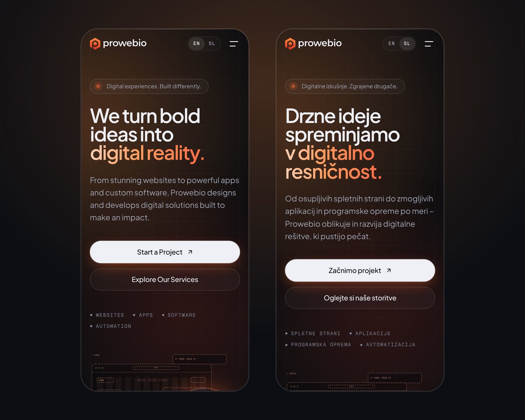
Everything is in English and Slovenian, down to the contact form's error messages. Slovenian pages have Slovenian addresses, such as /sl/cenik for the pricing page, and each page tells search engines where its translation is.
We also handle a detail of Slovenian typography that most sites skip: one-letter words like “v”, “z” and “s” are never left alone at the end of a line.
Prices in public
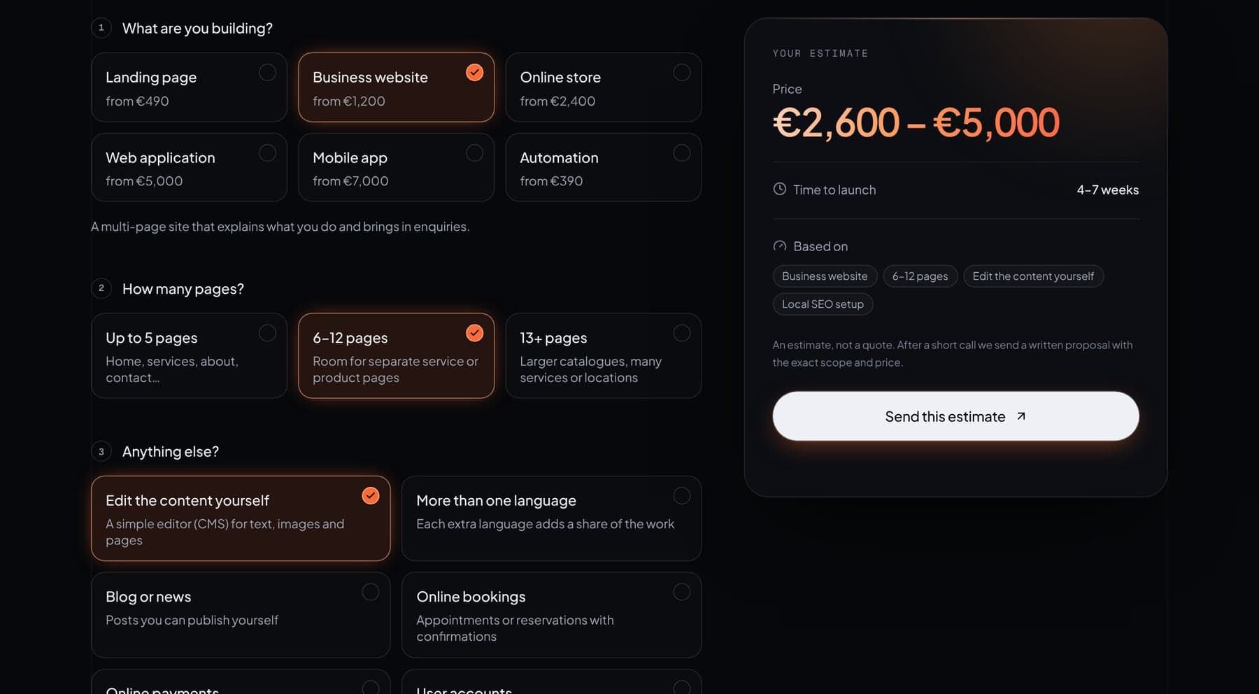
Our pricing page lists starting prices and has an estimator that adds up a project as you choose. It's a few hundred lines of code and a table of numbers, and it answers the first question almost everyone has. When you send an estimate, it fills in the contact form for you.
What we'd suggest copying
- Pages generated in advance wherever the content doesn't change by the minute.
- Real text before design. It's much easier to design around words that exist than around placeholder text.
- A contact form that explains errors kindly and says what happens after you send it.
- Published prices, even if they're only starting points.
What we'd skip for most clients
The animated blueprint lens at the top of our home page took far longer than its size suggests. It's our shop window, so it was worth it to us. For most businesses that time is better spent on content, real photos and speed.
If you'd like something similar for your business, tell us about it or start with the estimator.
Have a question we didn't answer?
Write to us. We'll give you a straight answer, even if it's that you don't need us.
Keep reading

3 min read
What a website really costs in 2026
Our actual prices, what moves them up or down, and the running costs that usually only come up after launch.

2 min read
You might not need a custom website
Website builders like Squarespace, Wix and Shopify are good tools. When they're the better choice, and the signs that you've outgrown them.
2 min read
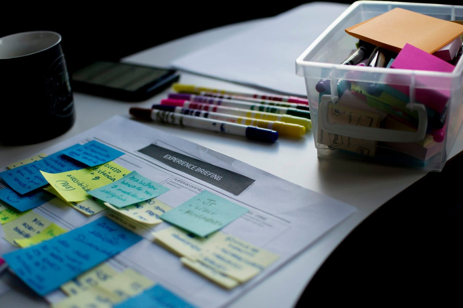
What to prepare before you contact a web studio
A short checklist for a more accurate quote, a faster start and fewer surprises, whoever you end up working with.